
Squarespace Font Pairings for Wedding Pros (2026 Edition)
Font Pairings for Wedding Pros (2026 Edition)
Choosing the right fonts for your website isn’t about trends — it’s about tone, pacing, and how your brand feels when someone lands on your page.
Below are some of my favorite font pairings for wedding professionals in 2026. Each combination is timeless, intentional, and designed to feel elevated without losing warmth.
To keep comparisons honest, each pairing is shown with the same sample text — so you can focus on the feeling, not the fluff.
A quick note on using these fonts
All of the font pairings below are available in Squarespace or can be easily added through Squarespace’s font library. That means you can use them whether you’re working with my signature custom website design or styling one of my website templates for wedding pros.
No extra font licenses, no complicated installs — just thoughtful typography that works beautifully inside the platform.
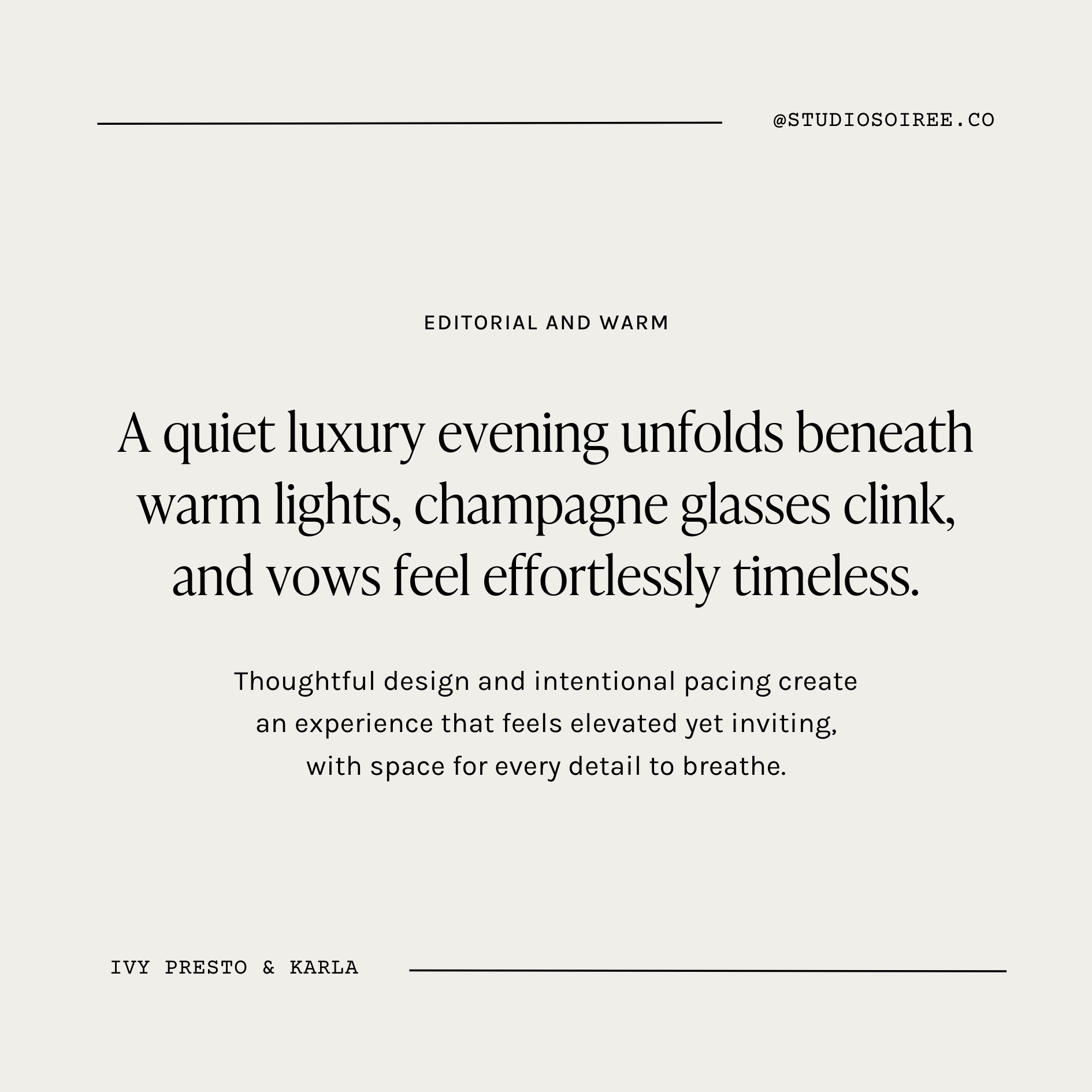
Ivy Presto & Karla
Editorial and Warm
A refined serif paired with a soft, modern sans. This combination feels fashion-forward yet approachable — perfect for brands that want elegance without stiffness.
Best for:
Wedding planners
Editorial photographers
Boutique studios
Brands with a polished but inviting tone
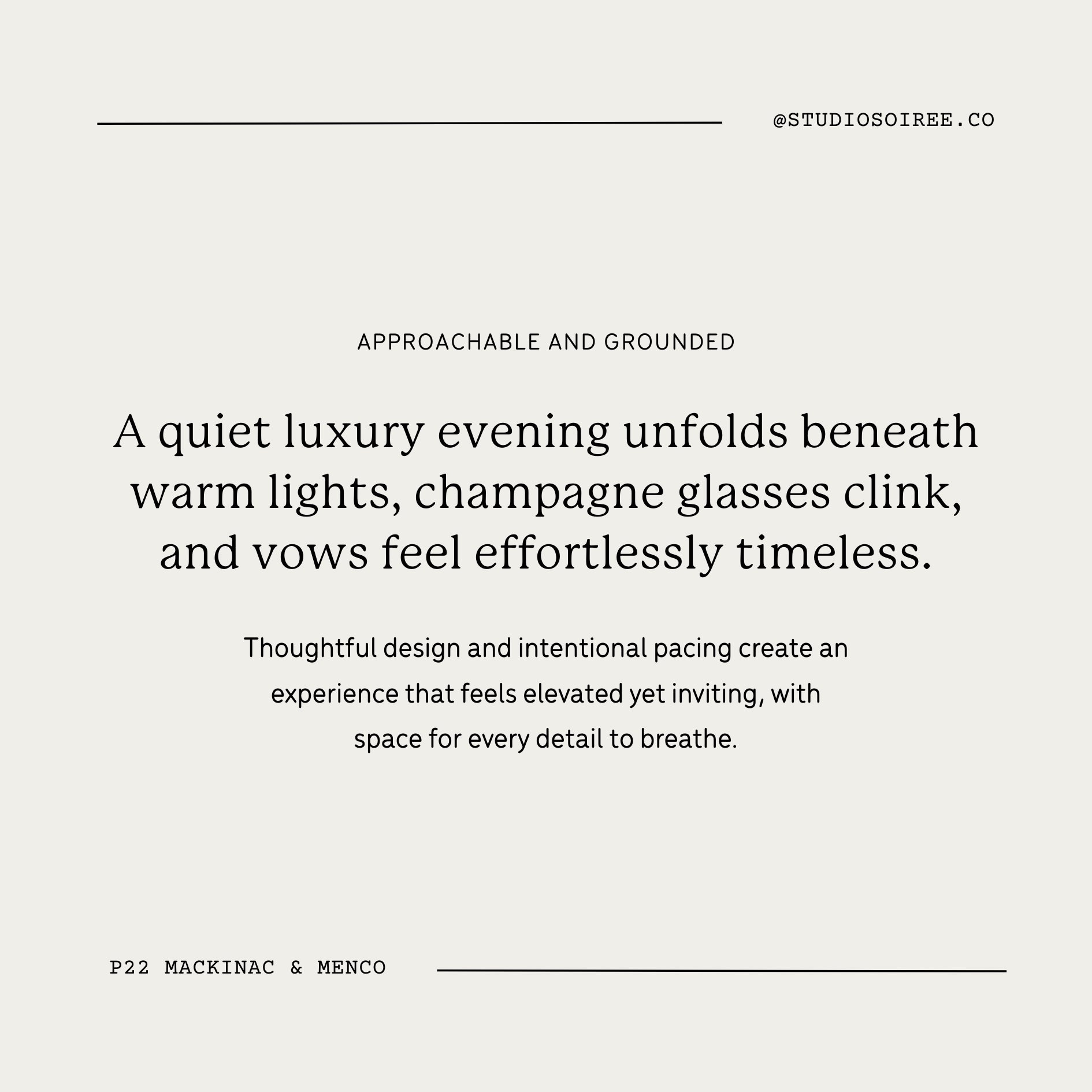
P22 Mackinac Pro & Menco
Approachable and Grounded
This pairing leans confident and thoughtful. Mackinac brings substance, while Menco keeps things friendly and readable. It feels trustworthy, calm, and quietly elevated.
Best for:
Wedding venues
Estate or countryside locations
Hospitality-leaning brands
Teams that value clarity and warmth
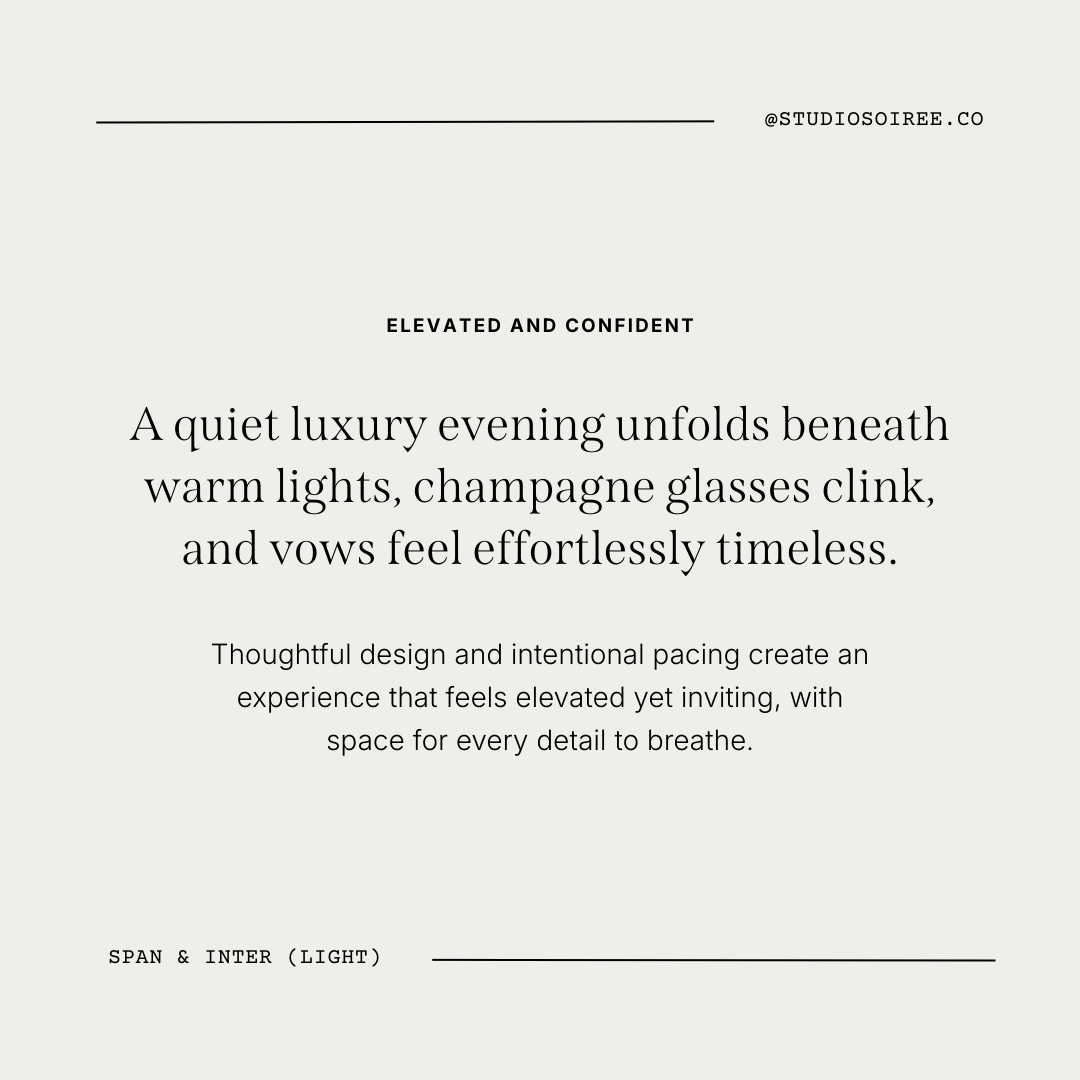
Span & Inter (Light)
Elevated and Confident
A bold serif moment softened by a clean, minimal sans. This pairing feels modern, self-assured, and editorial without being loud.
Best for:
Modern planners
Creative studios
Destination wedding brands
Designers who want presence without excess
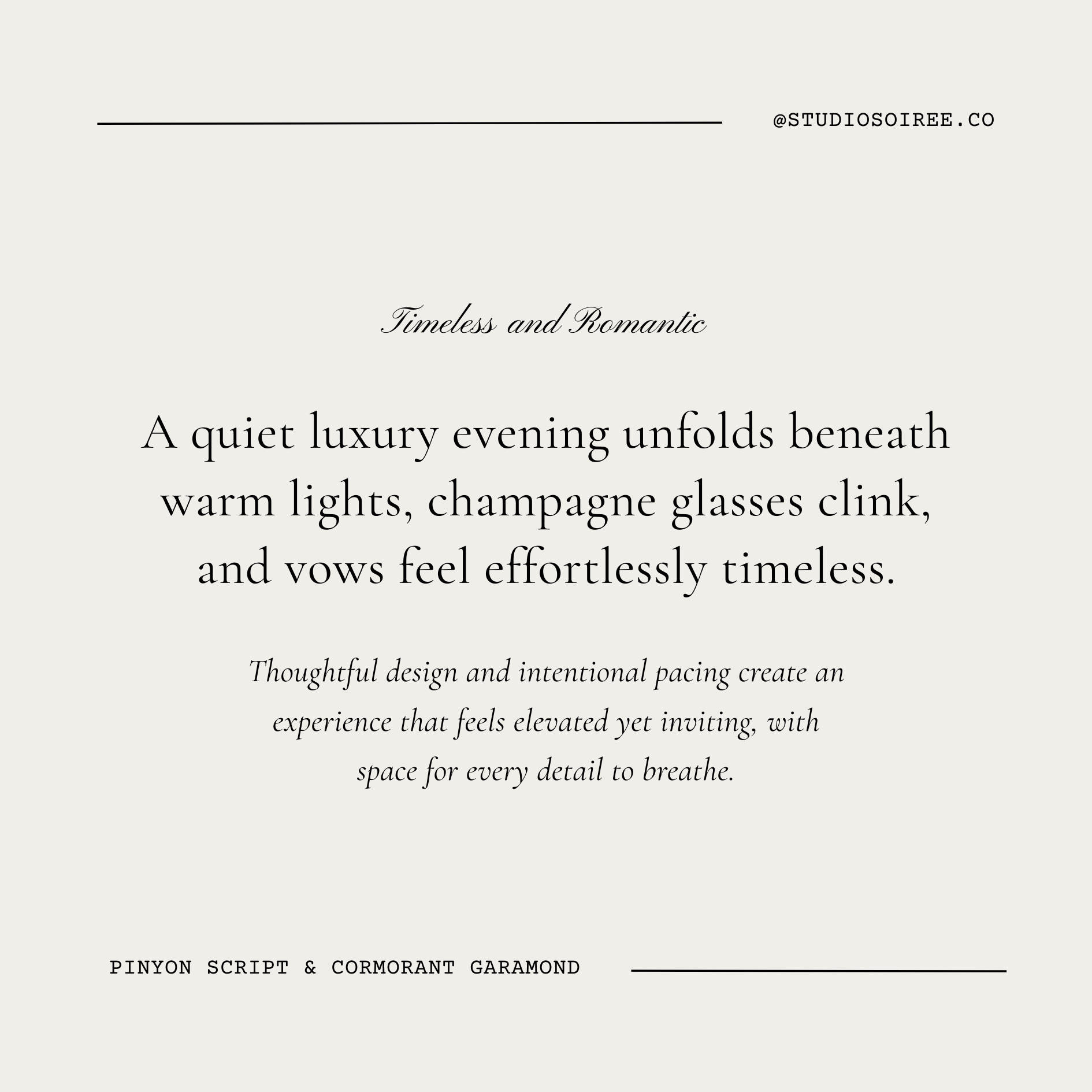
Pinyon Script & Cormorant Garamond
Timeless and Romantic
A restrained script paired with an elegant serif creates a classic, romantic feel — but only when used sparingly. This works best as an accent system, not an everyday workhorse.
Best for:
Fine-art photographers
Romantic or traditional venues
Intimate weddings
Brands that lean poetic and sentimental
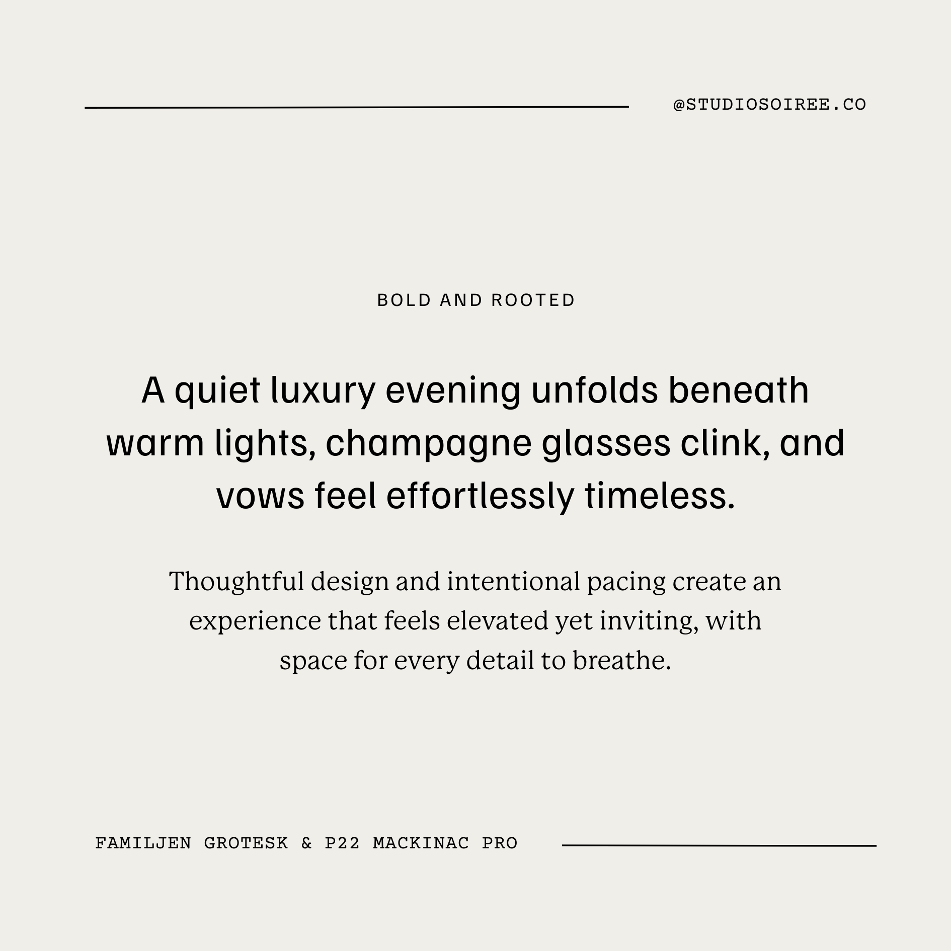
Familjen Grotesk & P22 Mackinac Pro
Bold and Rooted
A confident, modern headline font grounded by an editorial body serif. This pairing feels current, strong, and intentional — very 2026 when given room to breathe.
Best for:
Modern venues
Design-forward planners
Pet sitting + childcare
Makeup + beauty artists
Brands that balance creativity with trust
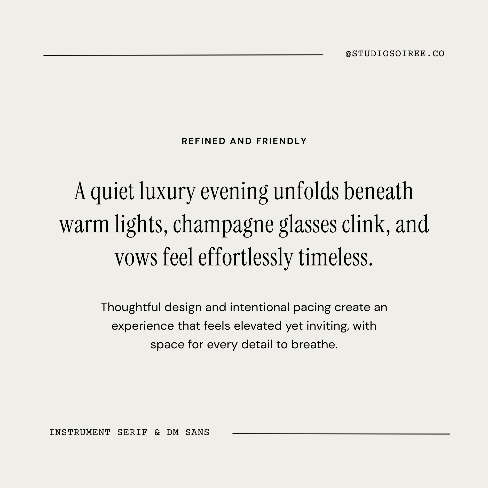
Instrument Serif & DM Sans
This is an easy favorite. Instrument Serif brings elegance, while DM Sans keeps everything light and accessible. It feels expensive without feeling unapproachable.
Best for:
Service-based wedding pros
Hair & makeup artists
Florists
Brands that value warmth and professionalism equally
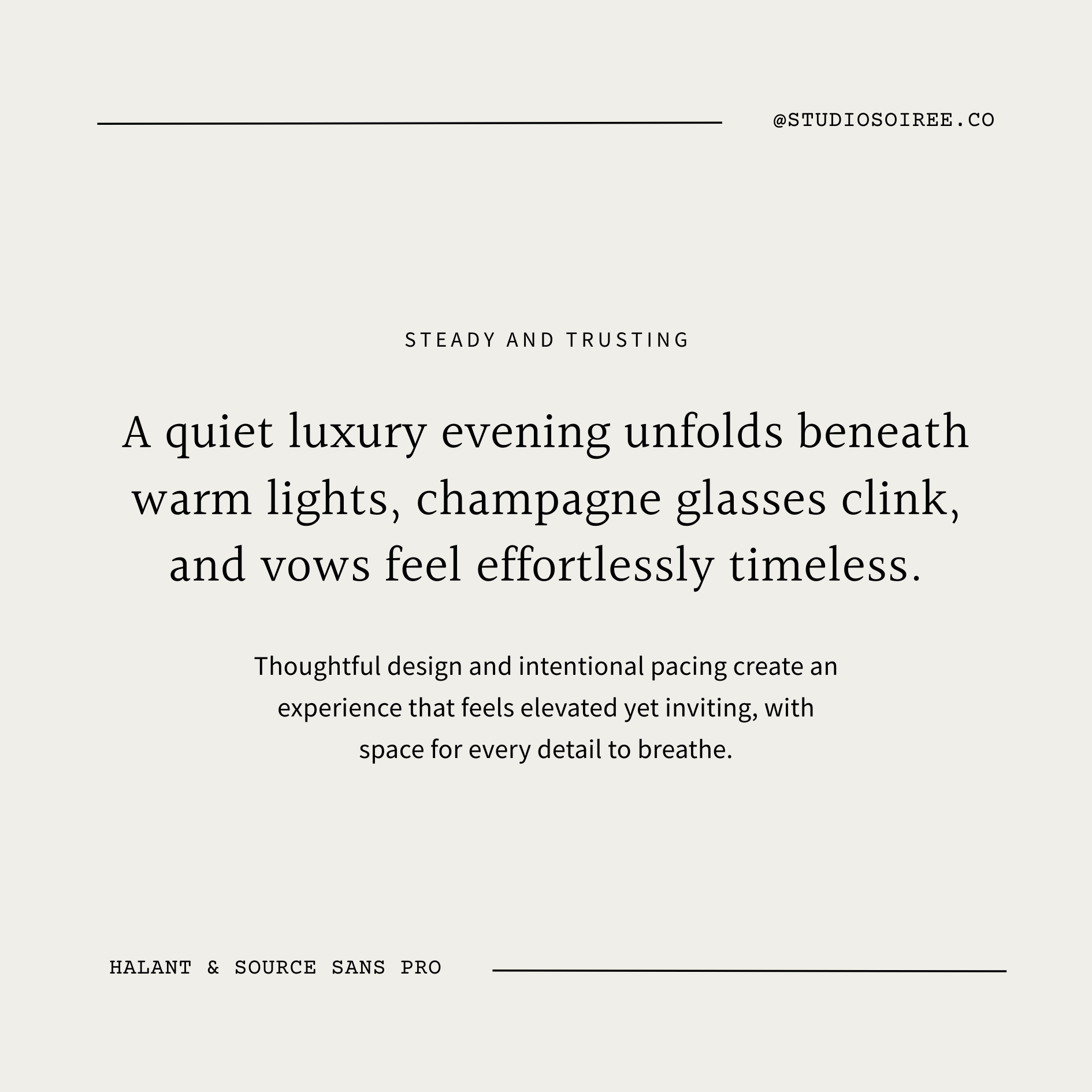
Halant & Source Sans Pro
Steady and Trusting
A classic serif paired with a highly readable sans. This combination prioritizes clarity and credibility while still feeling elevated.
Best for:
Venues
Multi-service wedding businesses
Established brands
Teams that want longevity over trends
How to Use These Pairings Well
A few notes to keep these fonts feeling modern in 2026:
Use generous spacing — let the type breathe
Avoid stacking too many expressive fonts together
Choose one “personality” font and let the rest support it
When in doubt, lighter weights almost always feel more editorial
Typography isn’t about choosing the prettiest font — it’s about choosing the one that quietly reinforces your brand’s voice.
Typography is just the beginning.
I design thoughtful, elevated Squarespace websites for wedding professionals — from fully custom builds to template styling — so your online presence feels as considered as your work.